DCX Dashboard
The DCX Dashboard graphs historic data and events over a selected time period.

Order Name
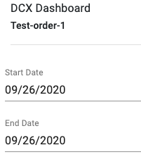
The top of the DCX Dashboard contains the order name.
Start and End Date
Select the start and end date to update the currently selected graph.
Report Card
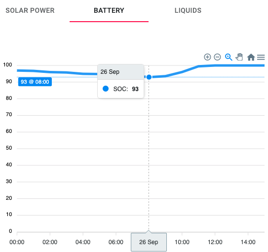
The report card has a number of tabs along the top to switch between different data categories, for example, Solar Power, Battery, Liquids and CO2.

Details
Mouse over or tap the graph to select a point on it and show the exact value at that point in time.
Zoom
Drag across the graph to select a time range to zoom into.
Downloading Data
Hit the menu icon on the right to display the option to download the data in the graph in a number of different formats. If you want to download data for multiple orders and/or data across graphs, use the ‘Export’ option in the ‘Models and orders’ menu.
Fuel
If the ConnX system has a fuel sensor, the ‘Liquids’ tab will show the fuel level, either ‘Low’ if the level is at or below 40%, otherwise ‘Ok’.
CO2 Savings
CO2 savings are calculated based on the assumption that solar power incoming is replacing the use of the generator. Testing of the generator has produced a figure of 0.692L per kWh which equates to 1.22 kg CO2 per kWh.